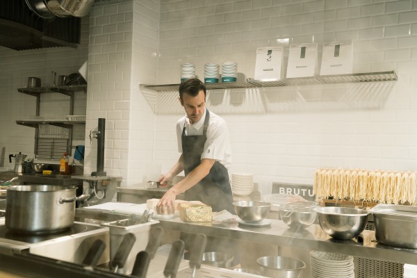
For years, professional uniforms stayed within a very predictable palette: white, black, gray and navy. Safe colors, but with little to say.
The uniform is no longer purely practical. It is also part of the visual identity of a restaurant, hotel, coffee shop or any professional space. And color has become one of the most direct tools for building that identity.
For 2027, trends are moving in two directions. On one hand, intense colors that add character. On the other, natural and warm tones that are easy to integrate into any space.
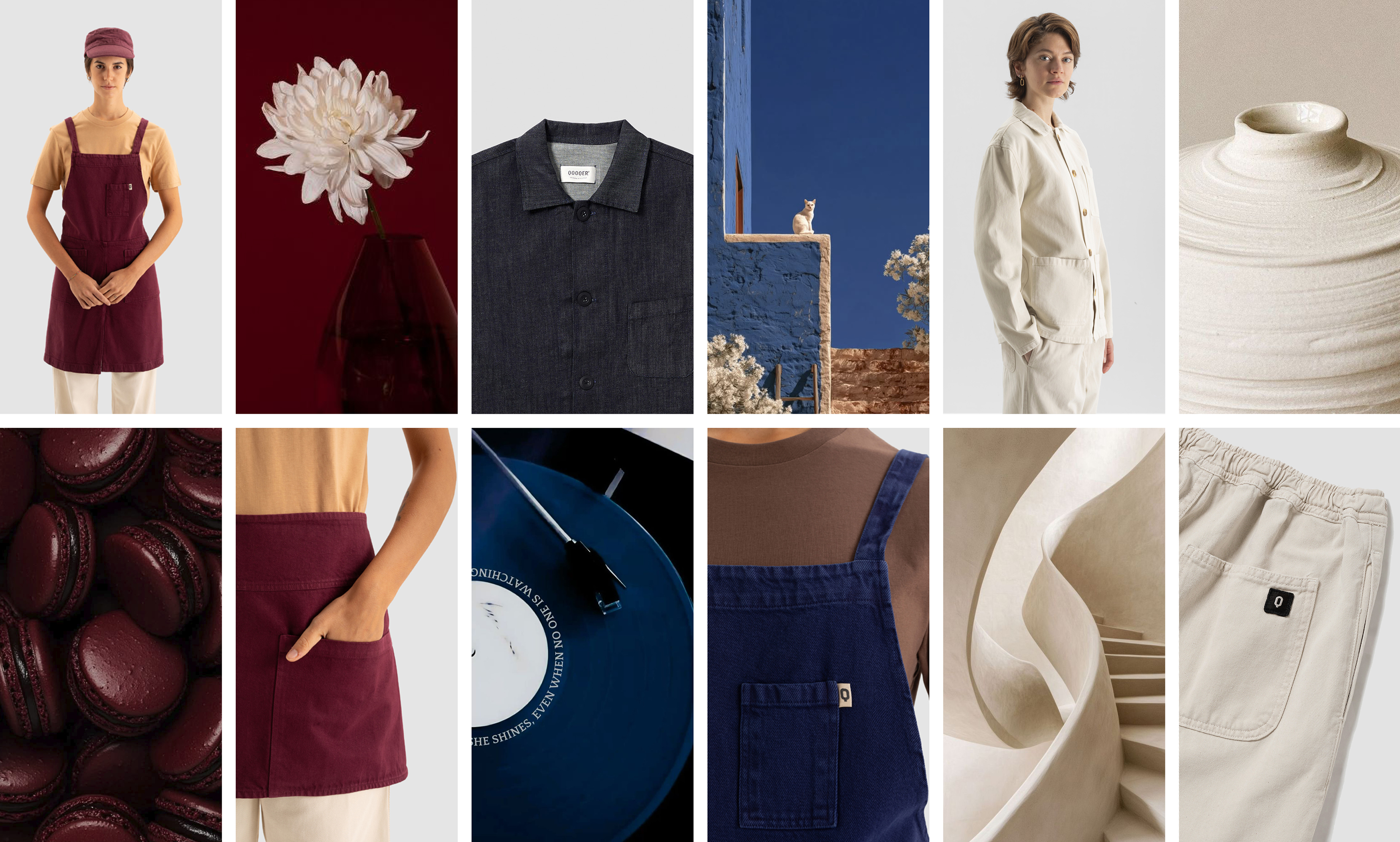
At QOOQER, we have selected the three colors that best balance style and functionality in everyday service: deep blue, Clay and brown.

01. Deep blue: the uniform color of 2027
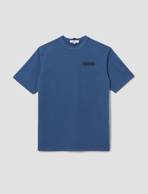
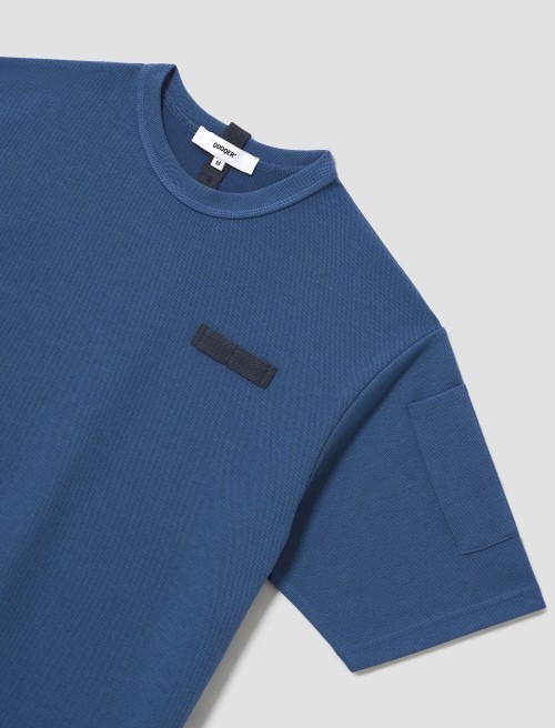
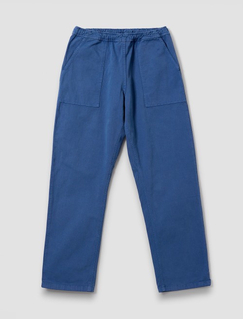
Deep blue is the trending color for professional uniforms in 2027. It is inspired by Luminous Blue, named Color of the Year 2027 by WGSN and Coloro. It is a deep, vibrant blue that combines natural and technological references.
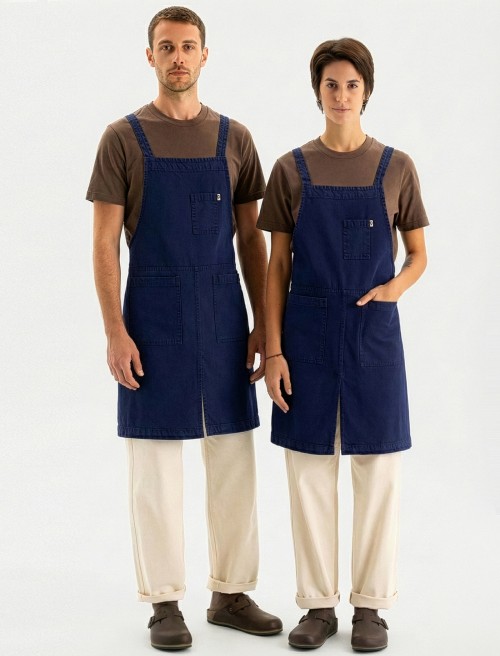
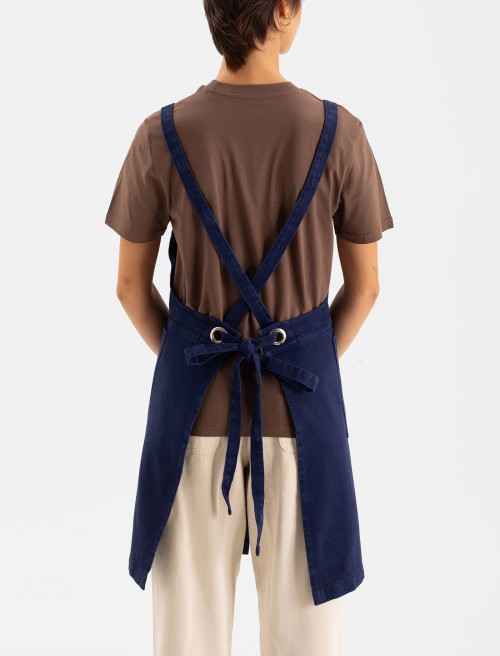
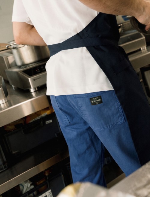
At QOOQER, we have brought it into workwear in three shades: Klein, Coastal and Midnight, offering a contemporary alternative to traditional navy. It creates recognizable uniforms without being overpowering. It works especially well in jackets, pants and aprons.
How to combine it: with ecru, brown or even another shade of blue for a tonal look.


02. Clay: the new neutral for uniforms
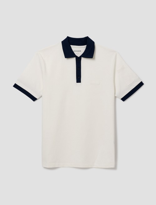
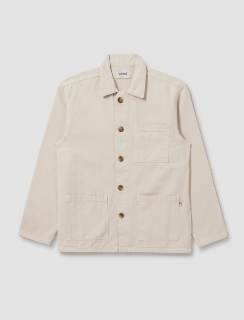
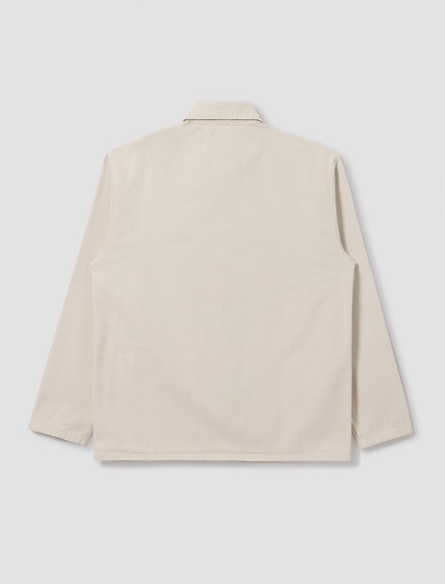
Clay is the trending neutral for professional uniforms in 2027: an earthy tone with a pink undertone that WGSN and Coloro include among the key colors of the season. It is different enough to update the look of a uniform, yet neutral enough to remain relevant for several seasons.
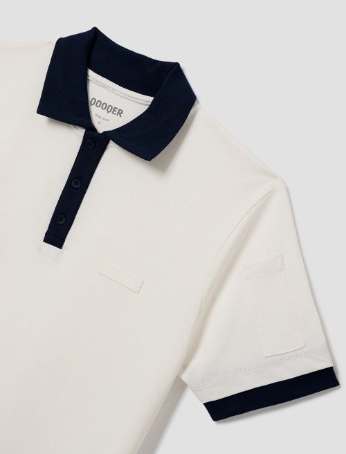
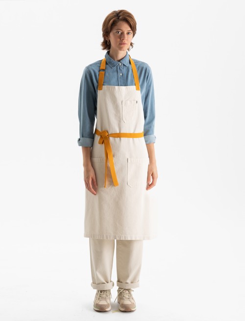
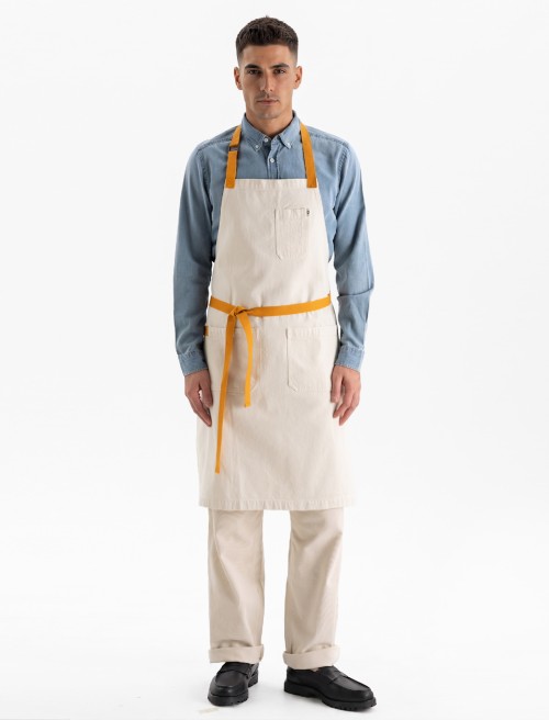
At QOOQER, we work with it alongside sand, ecru, stone, cocoa and beige — a family of warm neutrals with more personality than gray or white. It works particularly well in jackets, polos and front-of-house shirts, where the uniform is seen up close and conveys a sense of warmth.
How to combine it: with brown or off-white for a warm, natural look, or with navy, army green or burgundy to modernize a classic uniform.

03. Brown: the alternative to black in uniforms
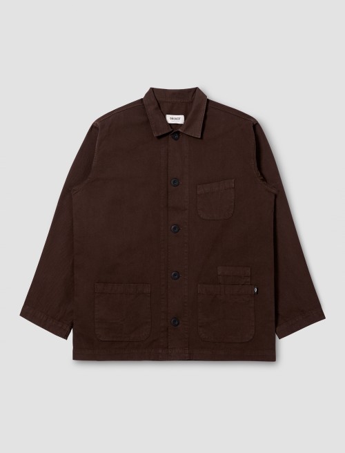
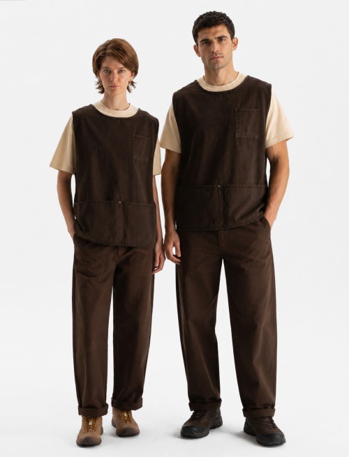
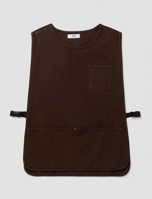
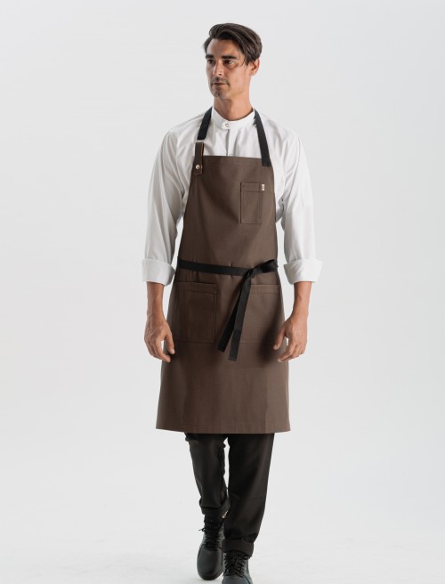
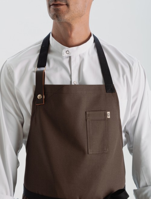
Brown is the alternative to black in professional uniforms for 2027. It is no longer associated only with rustic or traditional styles and has become one of the most versatile neutrals in hospitality. It retains the sobriety of black while adding warmth and personality.
At QOOQER, we work with deep, earthy browns such as Walnut and Moka, designed for everyday service. In the kitchen, they hide splashes of oil, coffee and sauces much better than light colors. Aprons, pants, jackets and shirts take on a more sophisticated appearance in this tone.
How to combine it: with ecru or sand for a warm, contemporary look, or with black and deep blue for a stronger visual statement.


How to combine colors in a uniform: the 60-30-10 rule
A uniform with color does not have to be a one-color uniform. The most effective way to bring a trend into workwear is to distribute it using the 60-30-10 rule, the same approach used in interior design:
- 60% base: a neutral that creates unity across the team, in a shirt, polo or jacket.
- 30% complement: a supporting tone that does not compete, usually in the pants.
- 10% accent: the trending color, used in an apron, logo embroidery or accessories.
This gives the uniform personality without sacrificing cohesion. Discover some professional uniform color combinations based on the three trending colors for 2027:
| Base (60%) | Complement (30%) | Accent (10%) | Result |
|---|---|---|---|
| White | Brown | Klein Blue | Fresh and distinctive |
| Clay | Brown | Klein Blue | Warm with a vibrant touch |
| Clay | Navy | Burgundy | Classic, renewed |
| Brown | Black | Klein Blue | Refined and bold |
| Midnight Blue | White | Brown | Contemporary and easy to maintain |
For more ideas, explore Sanzo Wada's Dictionary of Color Combinations, a classic reference in Japanese design featuring hundreds of palettes to inspire designers and brands.

What works in service: our expert's perspective
A trending color has to stand up to the demands of everyday service, not just look good on day one.
Intense colors can lose their vibrancy with high-temperature washing. That is why it is worth reserving the accent for garments that are replaced more frequently, such as the apron, while keeping the base in neutral tones that age better.
In the kitchen, browns and deep blues are particularly practical: they hide splashes of oil, coffee and sauces and maintain a good appearance throughout the shift.
And if you have a large team, a practical tip: order all garments from the same production batch. This is the best way to ensure the shade is identical across all uniforms, including when garments are replenished.
Juan Simón, founder, brand architect & creative director at QOOQER.
How to choose your hospitality team's uniform colors
Using color for uniforms does not mean dressing the entire team identically. The key is to create a cohesive palette that reinforces the business's identity. These four guidelines can help:
- Differentiate areas by color. Dress kitchen and front-of-house teams in different shades from the same color family to maintain visual unity while allowing customers to identify each role at a glance.
- Reserve one color for the accent. A more distinctive shade in aprons, accessories or logo embroidery adds personality without taking attention away from the overall look.
- Limit the palette to a maximum of three colors. Beyond that, the uniform loses cohesion and becomes harder to maintain as the team grows or garments need replacing.
- Integrate the uniform into the space. Team colors should work with the venue's decor, furniture and lighting rather than compete with them.
Frequently asked questions
What is the uniform color for 2027?
Deep blue. It is inspired by Luminous Blue, WGSN and Coloro's Color of the Year 2027, and replaces traditional navy in jackets, pants and aprons. Alongside it, Clay and brown complete the three trending colors for professional uniforms in 2027.
Which apron color hides stains best?
Deep browns and intense blues. They hide splashes of oil, coffee and sauces much better than white or light colors, making them particularly practical for kitchens and bars.
Why replace black with brown in hospitality?
Because brown retains the sobriety of black while adding warmth and personality. It also pairs well with wood, ecru and beige, materials and tones commonly found in restaurant and coffee shop interiors.
What is Clay?
Clay is an earthy neutral with a pink undertone (Coloro code 014-60-13) that WGSN and Coloro have included among the key colors for 2027. In uniforms, it works as a base color: it updates the team's look while remaining relevant for several seasons.
How can you introduce a trending color without changing the entire uniform?
Keep a neutral base (ecru, sand or brown) and apply the trending color to a single garment, usually the apron. It is the garment that is replaced most frequently, making it possible to update the uniform each season without changing the rest.